Colors, samples, and materials affect our well-being and, ultimately, our productivity in the office too. To have an impact, a coordinated furnishing concept needs to respond to all sorts of requirements. Just like the Human-Centered Workplace, which focuses on people’s needs.
We developed our mood boards to inspire you creatives when designing workplaces like those. Their purpose is to help you select colors and materials and offer a design toolbox for appealingly matched environments.
Pure – playfully fresh
Welcome to Pure’s Scandinavian color palette. It encompasses the hues of a sandy beach, the grey-blue ocean, green carpets of moss, and gray stone shades. These are paired with playful pops of color in delicate blueberry purple and pink.
- Atmosphere: A natural, tranquil, and fresh appeal
- Basic colors: Light gray, cream
- Accent colors: Mauve, mossy green, icy blue
Earth – natural fibers, wood, and warmth
The Earth color palette suggests warmth and a celebration of nature. Fluid-organic forms and high-quality wood elements blend in with the ecological design concept.
- Atmosphere: Warmth, organic elements, and a celebration of nature
- Basic colors: Sand, dark brown
- Accent colors: Golden yellow, copper, and dusky pink
Greenery – nature with fresh accents
An air of spring wafts into rooms furnished around the Greenery color concept. Lush green tones are pepped up by the fresh green of newly sprouting leaves and the delicate hues of flowers and rounded off with wood elements.
- Atmosphere: Calm, serene, harmonious
- Basic colors: Dark, rich green tones, spring green
- Accent colors: Sunshine yellow, cream, lavender
Sophisticated – craftsmanship meets cutting-edge technology
With high-quality, classic materials like leather and chrome, Sophisticated is all about tradition contrasted with contemporary accents. The mix of cold and warm colors, as well as diverse surfaces, is invigorating.
- Atmosphere: Stability, reliability, clarity
- Basic colors: Light gray, gray-beige, warm, dark brown
- Accent colors: Honey, gray-blue, icy blue
The Sophisticated mood board’s colors are reflected tastefully in the interiors at Amber Beverage Group.
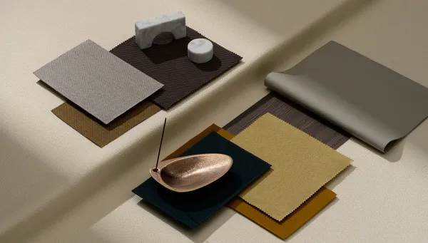
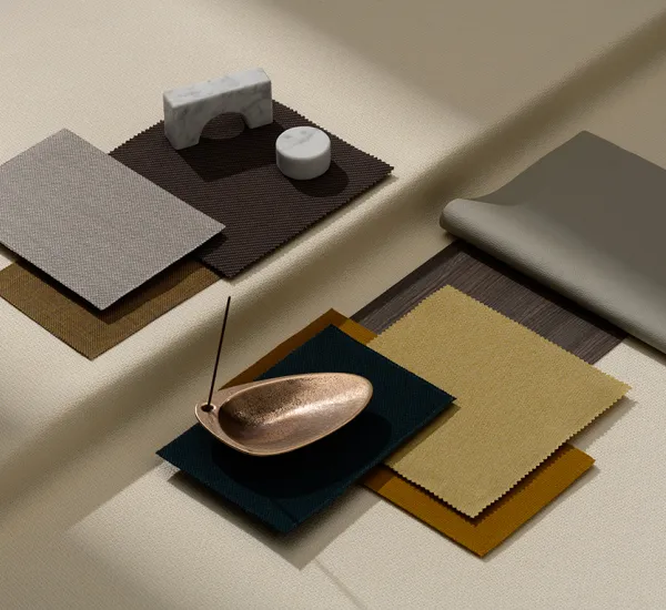
Delicate – understated elegance
With its understated colors and natural textures, Delicate exudes traditional elegance, underscored by gleaming, copper-colored accessories.
- Atmosphere: Poise, elegance, assurance
- Basic colors: Cream, taupe, light gray, gray-brown
- Accent colors: Dark emerald green, brass, sand
The Delicate color combinations feature in the office building belonging to luxury goods company Richemont in Amsterdam.
Super Real – digital dimensions
Innovative design concepts reflect the digitalization of the working environment. The futuristic Super Real color concept stands for innovation and plays with the concept of soft fabrics and cool, metallic surfaces.
- Atmosphere: Modern, practical, innovative
- Basic colors: Light gray, anthracite, ultramarine violet
- Accent colors: Muted purple, magenta, yellow-green
Use our mood boards to help you plan. Draw inspiration from the harmonious color and material combinations. And discover the many design options open to you with Wilkhahn furniture.
You can download more information here:
Mood boards brochure
You can also find more inspiring office environments in our digital reference projects.
Subscribe to our newsletter
We’ll tell you about exciting events, stories from the office world and interesting new products in our newsletter once a month. Subscribe here